Member-only story
10 Usability Mistakes Most Designers Make on Checkboxes
Before you use a checkbox on your interface, you got to ask yourself a couple of questions. Is a checkbox the right component to use in this context? If it is, what’s the most usable way to display them?
Many designers fail to ask these questions and automatically use checkboxes without much forethought. As a result, they create usability issues by using them in the wrong context.
Not only that, but many designers are lazy and expect native checkboxes to do the job instead of a custom checkbox design. But the problem is that native checkboxes don’t do the job because they have poor usability.
There are ten usability mistakes most designers make on checkboxes that undermine the user experience. It’s time to stop making these mistakes and start using checkboxes correctly.
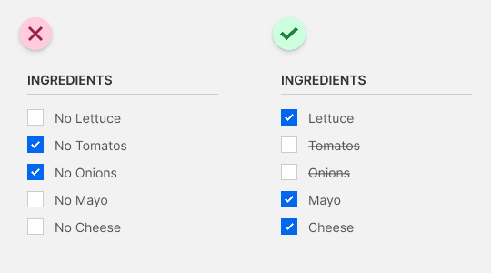
1: “No” labels are a no-no
Checkmarks universally signify affirmation, not negation. Checkbox labels that include “no” force users to affirm a negative, breaking their mental model of checkmarks. To emphasize item removal, check all the items by default and allow users to uncheck the ones they don’t want. Apply a strikethrough over the unchecked labels as an extra visual cue for negation.

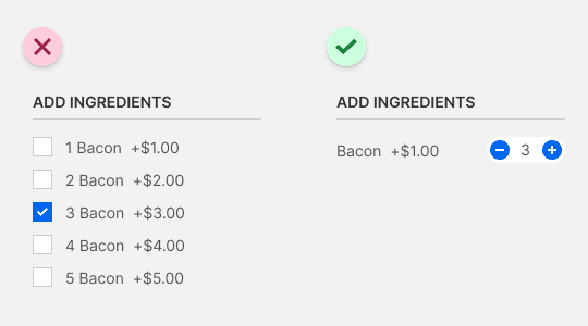
2: Duplicate items demand double duty
Sometimes you may want to offer an item in different quantities. Duplicating it with multiple checkboxes produces more text to read and clutters the interface. For incremental input changes, display the item once with a number picker.

3: A bigger target as a check token of gratitude
It’s no secret that checkboxes are hard to click due to their small hit target. Designers will often make the label clickable, but that doesn’t help if it isn’t intuitive. You can give users a bigger hit target and clearer interaction cue by converting your checkboxes into check tokens.
