Member-only story
Anatomy of an Optimally Designed Modal
Designing a modal is no easy task when there’s a lot to fit in such a tiny window. Throwing content inside and hoping it works is what most designers do. However, users can have trouble processing the information without the proper structure. You can make your modals easier for users to process if you design them with the optimal anatomy.
Modal Anatomy
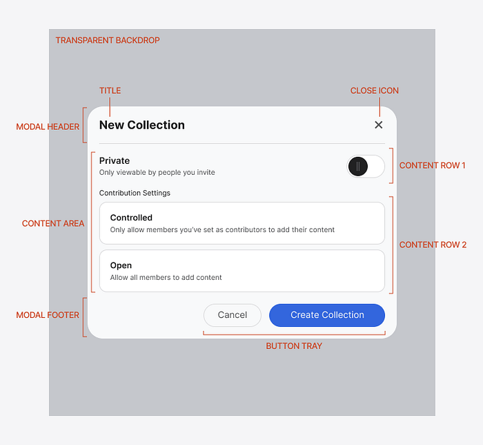
Every modal needs a header and footer. The header is where the title and “close” icon goes. The title is necessary to affirm to the user what task they’re doing if they forget or lose focus.

The “close” icon is a button that functions as a clearly marked exit for users to return to their previous screen. Giving users freedom and control of the interface allows them to correct their mistakes and explore without fear.
The footer contains a button tray, where you can place different buttons. Typically, you would include a primary button with a “Cancel” button that closes the modal just like the “X” icon does. Providing both buttons enables users to exit the modal without reading any text. The “X” is a safe, familiar, and reliable exit they easily recognize across platforms.
The content area is between the header and footer, where you can put text, images, or input components. Each content item is contained in a row that you can stack and set their height.
Behind the modal is a transparent backdrop that you overlay on the screen. The transparent layer allows users to see their previous screen behind it to remind them where they came from. It’s a visual cue that indicates no action has been performed yet, but they’re about to perform one on the modal screen.
Optimal Spacing
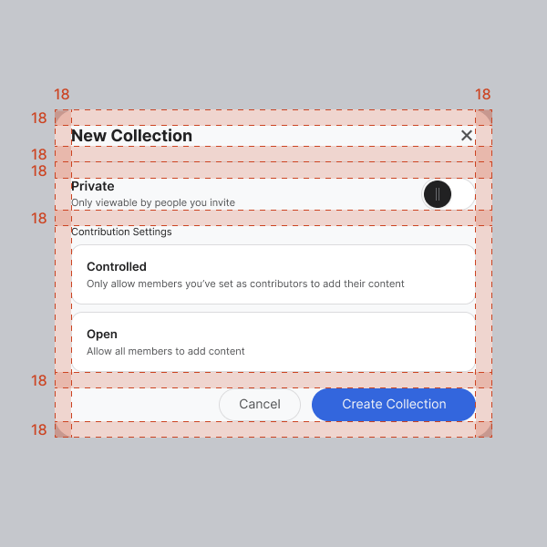
The spacing around the parts of the modal should be correct as well. Notice in the example how the margins between elements are consistently 18px. This consistency makes the modal look cohesive and space-efficient.

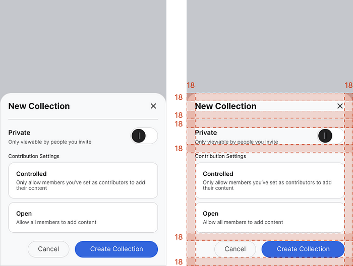
You should maintain this consistent spacing for modal sheets on mobile. Doing so allows you to maximize the confined space efficiently. It would use the same modal anatomy as desktop modals. The only difference is that the modal sheet would appear at the bottom and span the screen’s width.

Uniform Appearance
Following the proper modal anatomy enables you to design modals with the optimal structure. It creates a professional and uniform appearance that users respect. It’s much like putting a nice suit on your interface.
For more insightful design articles, get a subscription to the official UX Movement Newsletter on Substack
