Member-only story
How to Display Steppers on Mobile Forms
When your form has multiple pages, a stepper is a must. Steppers keep users informed about their progress by indicating what step they’re on and how many steps are left.
Displaying steppers on mobile forms is a challenge due to the limited screen space. Using the same stepper on your desktop form for your mobile form causes readability and visibility issues.
Linear Vs. Radial Steppers
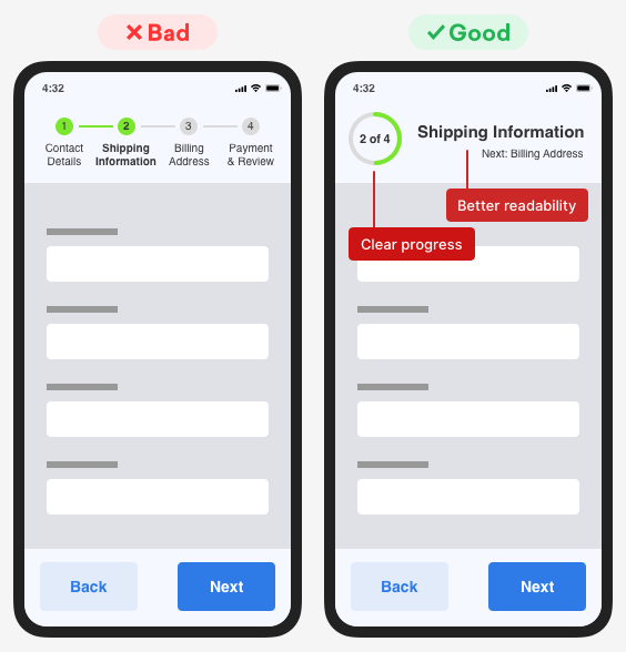
Linear steppers work well for desktop forms, but not for mobile forms. When you use a linear stepper on your mobile form, you decrease the readability of the step titles and the visibility of progress tracking.

Forcing the step titles to fit a tight space leads to smaller text sizes your users will have trouble reading. Not only that, but the progress visibility is less clear because it shows too many text and numbers at once. This creates visual noise and makes it harder for users to distinguish their current step.
Use a radial stepper on your mobile form because it’ll give your users clearer progress tracking and better readability. Your users will know at a glance what step they’re on because the radial stepper gives enough room for large step titles. It displays one step at a time allowing users to focus on the current step. It also offers enough room to indicate what the next step is.
Users will be able to track their progress quicker because it takes them fewer eye fixations to scan a radial stepper. Scanning a radial stepper only takes them a couple eye fixations. Scanning a linear stepper takes them at least 4 eye fixations. Fewer eye fixations allow them to process their progress faster, which encourages form completion.
Visibility + Readability Are Key
When users fill out multi-page forms on mobile devices, they need to know what step they’re on and their progress. The visibility and readability of your stepper are key to this. When the step titles and progress tracking are clear, the chance of form completion increases. But when they are hard to process, the chance of form abandonment increases. Which outcome do you want?
Originally published at https://uxmovement.com on December 18, 2018.
