Member-only story
How to Make Any Information-Heavy Design Look Less Busy
Power of emphasis and de-emphasis
There are many words to describe an information-heavy design. Some may call it cluttered, complicated, busy, or overwhelming. As a result, the designer assumes they need to reduce the amount of information displayed on the screen. However, showing too much information is not the real issue.
Removing some information could help, but the fundamental issue is that too many elements are competing for the user’s attention. This visual competition makes a design look cluttered, complicated, busy, or overwhelming.
Visual competition exists when you fail to direct the user’s attention toward specific elements. You should never treat everything on the screen equally, or you’ll create a “busy” effect.
Instead, you must direct the user’s attention by emphasizing high-priority elements and de-emphasizing low-priority elements. The way you do this is through varying degrees of visual contrast.
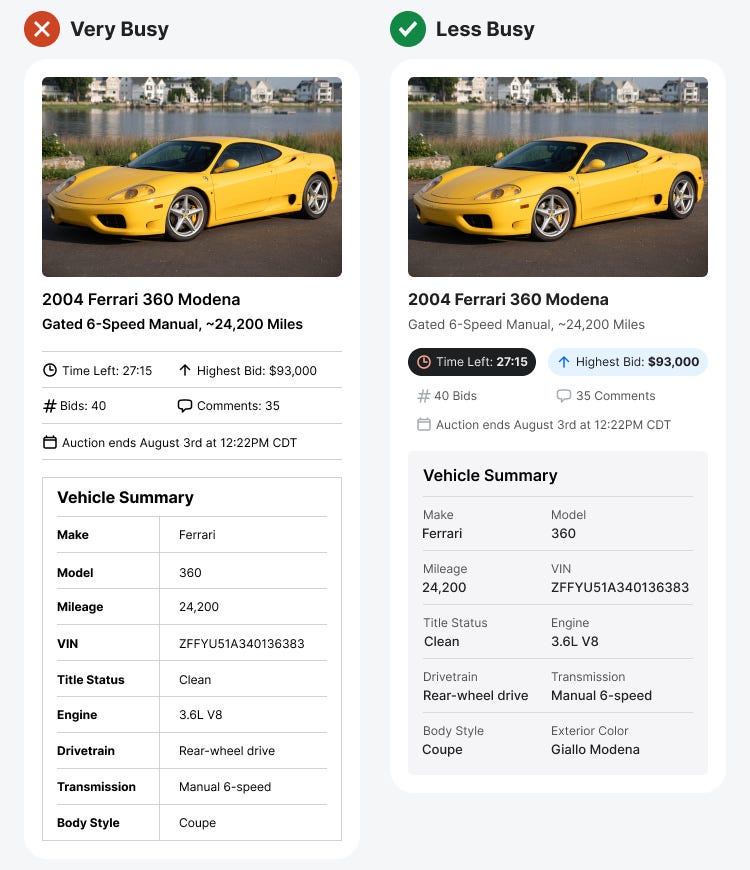
The very busy design shows an information-heavy interface with nearly the same contrast level across all elements. Some text may appear more bold here and there, but every element is trying to steal attention. In other words, the design does not have enough emphasis and de-emphasis.
Emphasize Elements by Priority
To determine which elements deserve emphasis and de-emphasis, consider which information is more important to the user. In the less busy design, you can quickly tell what has high priority by how much emphasis the elements have.
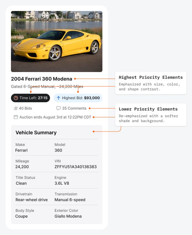
The most important data in the car auction are the post title, “Highest Bid,” and “Time Left.” Therefore, the design emphasizes that with size, color, and shape contrast. Since the “Time Left” data has a sense of urgency, it’s given the greatest emphasis with a dark color theme.
However, adding emphasis isn’t enough. You must also de-emphasize lower-priority elements. A softer shade is applied to lower priority data and the “Vehicle Summary” section to lighten the attention on…