Member-only story
Optimal Size and Spacing for Mobile Buttons
Tap, tap, tap! Are users able to hit your mobile buttons with high touch accuracy, or are they missing their target? Before you blame the user, check the size and spacing of your buttons.
If they don’t have an optimal size and spacing, it’s no wonder users are missing their target or hitting the wrong button. If you’re not sure what’s optimal, this article will reveal the answer. The measurements below are in CSS pixels at 96 DPI.
Button Size Standard
It’s hard to know if your buttons are optimal without a standard to go by. Luckily, research on button size and spacing has discovered a standard that works for most users, including the elderly.

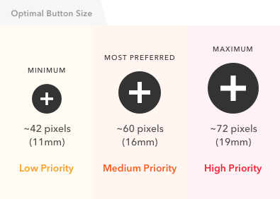
The study found that users had the lowest touch accuracy on buttons that were less than 42 pixels. Buttons that were over 72 pixels also had low accuracy.
The highest accuracy was found with buttons between 42–72 pixels. This means that 42 pixels is the minimum and 72 pixels is the maximum button size that’s most optimal for users.
The most preferred button size was 60 pixels, which is about the middle of the range. The 72 pixel button produced the highest touch accuracy and was preferred by older users.
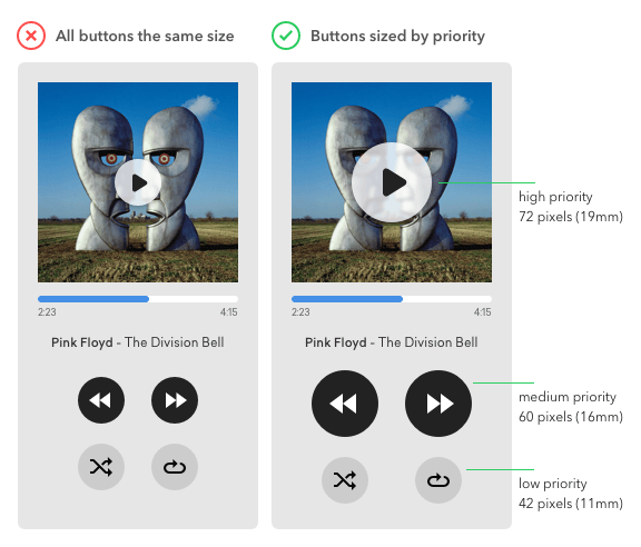
When using an array of buttons, it’s important to indicate priority. This way users know which actions will lead them to the most desired result. By following the button size standard, you can indicate priority in an effective way. No longer do you have to pick an arbitrary size and hope that it’s user-friendly.

The example demonstrates the use of the button size standard to indicate priority.
- High priority button = 72 pixels
- Medium priority button = 60 pixels
- Low priority button = 42 pixels
The buttons users use the most frequently are now easier to spot and tap. They’ll be able to tap it with a faster reaction time and higher accuracy. This is especially useful if the user’s attention is divided between different tasks.
