Member-only story
The Best Filter UI Design for Large-Scale Apps
Optimizing filter layout and interaction
Navigating a large-scape application without filters is like browsing a library without a catalog. It’s impossible to find what you’re looking for if you can’t narrow it down by criteria.
Providing users with a set of criteria to choose from isn’t easy. The first challenge is figuring out the best page layout to display the input fields. The second is figuring out the optimal way for users to interact with them.
Layout
There are two common filter layouts: left sidebar or horizontal toolbar.
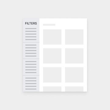
Left Sidebar
The advantage of a left sidebar is that it allows you to display more filters on the page without hiding the options. Since a page has infinite vertical space, you can stack them.

However, the downside is that users will often overlook and ignore these filters. It’s unclear to users that the sidebar is connected to the main content area they’re viewing (source).
Not only that, but users also have to scroll to see any filters at the bottom. As a result, they might miss some if they don’t scroll down all the way. Requiring users to do extra work to see the filters isn’t a realistic expectation.
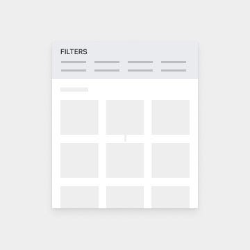
Horizontal Toolbar
A horizontal toolbar is a better layout for filters. The same study found that users interpreted controls above the content area as filters even when they weren’t. This means that users expect filters to be there. They perceive it as more connected with the main content and more accessible.

However, the challenge with a horizontal toolbar is displaying the filters in a viewable way due to space limitations. You cannot stack them like you can with a sidebar because you don’t have infinite horizontal space. This space limitation can present interaction issues.
Interaction
When interacting with filters, users need to be able to make selections quickly with minimal effort…
