Member-only story
The Best Mobile UI for Picking Date and Time
A better alternative to native pickers
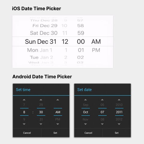
Booking appointments online is a challenging task on mobile devices. One reason is that most interfaces use native iOS and Android pickers that are a pain to use.
Native pickers are the input components that spin like slot machines. The user has to swipe their finger up and down each slot to select a date and time.

If they swipe too hard, they could easily miss the intended input. To select the correct input, they have to carefully swipe to the value they want with the right amount of force.
Picking a date and time on a booking form shouldn’t feel like a silly game. Users want to book their appointment and move on with the next activity in their life. The more time they waste fiddling with the native picker, the more frustrated they’ll get.
It’s best not to use native pickers for selecting dates and time. Instead, designing chip components will allow you to provide a more seamless user experience.
Date Chips
Chip components are versatile because you can use vertical or horizontal ones depending on the context. With dates, it’s better to use vertical chips because the text label isn’t that long.
