Member-only story
The Confusing State of Toggle Switches
Most users know how to toggle the switches on electrical devices, but get confused with the interface ones. They often have trouble discerning whether a switch is indicating a status or command. If the switch is “on,” users could interpret it as the current state, or as the action that occurs when they toggle it.
Indicating Status
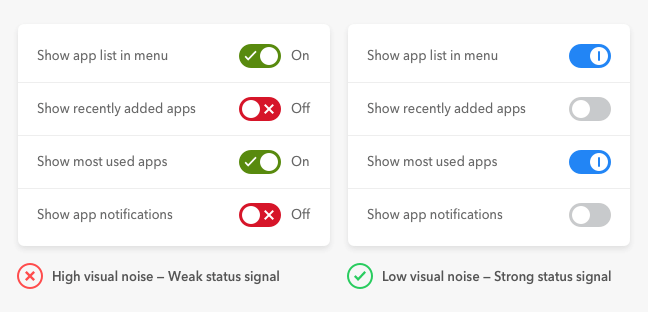
It’s not always clear to users that toggle switches signify the current state. This confusion happens when there are on/off labels, green/red colors, or checkmarks on them. These cues produce high visual noise that weakens status communication. Without a clear “on” signal, users fail to perceive the switches as indicators of state.

When communicating status, you only need to signify what’s active, not what’s inactive. Using cues to indicate both the active and inactive state makes users interact with switches like commands. Users have a habit of perceiving visual cues like call to actions when there are many of them in a group. Seeing them on every switch makes them think it’s informing them what the control will do instead of what it’s currently doing.
To prevent users from misinterpreting your switches, reduce the visual noise on them and only provide a cue for the “on” state. The “off” state of your switches should have a neutral color, so it doesn’t steal…
