Member-only story
The Fastest Navigation Layout for a Three-Level Menu
When users navigate an interface, they have a need for speed. The faster it is for them to find what they’re looking for, the more time they’ll save on their task.
A common navigation pattern that needs speed is the three-level menu. You’ll often find it on dashboard interfaces and desktop applications. The way to increase the navigation speed of a three-level menu is to use the optimal layout.
A research study ( A comparison of three-level menu navigation structures for web design) has shed some light on which layout is fastest to navigate. They evaluated various three-level menu layouts based on several criteria categories.
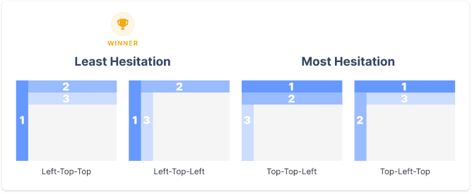
The navigation layouts include top-top-top, top-left-left, top-top-left, top-left-top, left-left-left, left-top-top, left-left-top, and left-top-left. The level notations are ordered by priority and hierarchy (i.e., primary[1]-secondary[2]-tertiary[3]). The criteria categories include navigation time, user hesitation, cursor movement, selection errors, and user preference.
Navigation Time
The study discovered that a left primary is faster to navigate than a top primary. This effect also applies to left secondary menu levels. It also found that navigation is faster when the primary level is separate from the secondary and tertiary levels. Overall, left-top-top and top-left-left were the fastest, and top-top-top and top-top-left were the slowest.

User Hesitation
A hesitation is when the user hesitates to move their cursor from one menu level to another. The left-top-top had the least hesitation out of all the layouts, and the top-left-left had the most. There was a significant decrease in hesitation when the secondary and tertiary levels were on the same plane.

Cursor Movement
The frequency of cursor movements to the incorrect plane represented a cursor movement. There were fewer cursor movements when the primary menu was on the left. Fewer cursor movements also occurred when the secondary level was split from the…
