Member-only story
Optimal Placement for Mobile Call to Action Buttons
Did you know that where you place your buttons affects how fast users complete their task? Quicker task completion results in a more satisfying experience. If this is what you want, you have to place your buttons where users expect to find them.
Here’s a comprehensive analysis of all the button placements you could use. Learn which button placement is the optimal one for your app, so users don’t waste their time.
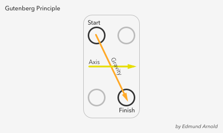
Gutenberg Principle
Before users can take action, they have to scan the screen. The screen content informs their decision on which action to take. As soon as they finish scanning, the call to action should present itself. Where do their eyes end up when they finish?

It turns out they start at the top left corner and finish in the bottom right, moving their eyes in a zig-zag. Renown newspaper designer Edmund Arnold called this natural scanning pattern the Gutenberg Principle.
The principle illustrates how the eye moves from left to right along an axis of orientation until it reaches the bottom right corner. It forms a prominent scanning path called reading gravity. Design elements that lie along the diagonal get the most attention. Elements that lie outside it receive less.
Optimal button placement follows the Gutenberg Principle. You should place your buttons at the end of the user’s scanning path when they’re ready to take action. There are rare cases when users are ready to take action before scanning, but this is only when they’re already familiar with the screen content.
Top Vs. Bottom Button
The first location to decide on is whether to place your call to action button at the top or bottom of the screen. Which button placement follows the Gutenberg Principle?
Most users start by scan the content first because it relates to their task and dominates the screen. Their eyes move from the top half of the screen towards the bottom. When the content ends, they’re looking for a call to action.
Their eyes remain at the bottom as they’re searching for a button until they can’t find one. That’s when they scramble their eyes to the top of the screen and stumble upon it in the top…
