Member-only story
The Optimal Way to Display Modals on Mobile Screens
Turning modal windows into modal sheets
Are you displaying your modals optimally on mobile screens? A modal window on a desktop screen shouldn’t look the same on a mobile one.
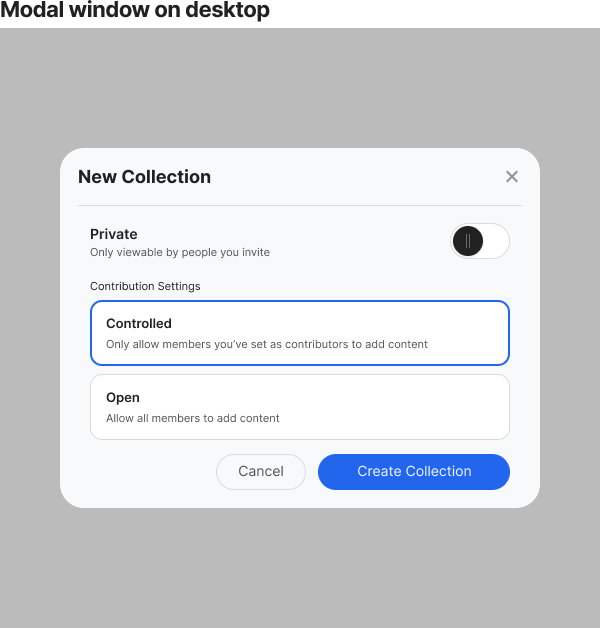
Desktop modal windows open in the center of the screen with a transparent backdrop. Users can see through the backdrop to the parent screen as the child window is overlaid on top. The window has ample room to display content, and the buttons are easy to click.

There’s no problem with this layout on a desktop screen, but it causes spacing and content issues on mobile. Not only that, but it makes the buttons harder to touch.

The backdrop margins occupy the left and right screen edges, diminishing the real estate. As a result, the modal window is too compact, which limits the content display. The more packed the content is, the harder it is to scan.
Since it’s fixed in the center of the screen, the user’s thumb cannot easily reach buttons when holding the phone with one hand. They may have to use both hands or move their hand up to reach them.
Modal Sheets
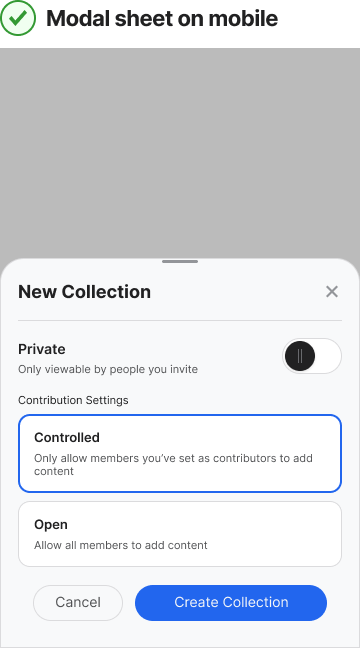
Instead of displaying modals in a window on mobile screens, you should use modal sheets. A modal sheet opens from the bottom of the screen and spans the entire width. As a result, the content uses as much real estate as possible.
The transparent backdrop peeks above the sheet. The height of the sheet can stretch as high as needed as long as the backdrop is partially visible. You can make the content area scrollable if you have a lot to display. However, keep the header fixed so users can leave the sheet whenever they need.

At the top of the modal sheet is the header. The header contains the title, close button, and swipe handle. The swipe handle allows is in the top-center of the header that allows users to swipe down to leave the modal instead of tapping the button. This interaction offers users more flexibility for moving between screens.
Make sure to use a line divider to separate the header from content. Also, make sure you have sufficient margin spacing around the content area of the modal.
If your mobile app uses modals, it’s important to make them easy to touch. Make the switch from modal windows to modal sheets, and you’ll help users interact with your screens quicker and easier.
For more insightful design articles, get a subscription to the official UX Movement Newsletter on Substack
