Member-only story
Why Toggle Buttons Are Confusing
Not all buttons perform actions. Sometimes they’re used to change states on an app. These are known as toggle buttons. They present two or more options in a single control and allow users to change states instantly. Problems identifying the active state can arise if you don’t design them correctly.
Inverted Vs. Direct Color Scheme
The challenge with toggle buttons is making the current state obvious. Users often have trouble identifying the active state when the visual cue isn’t clear. This confusion causes them to select the wrong option and activate an unintended state.
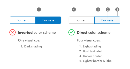
Confusion happens when the visual cue used to indicate the current state is an inverted color scheme. This style is typical on toggle buttons, but not optimal. It isn’t clear to users that the darker button signifies the active state. Many of them mistake the lighter button for the selected option because it also has an “on” appearance.

Inverted colors are problematic because they make the buttons too distinct from each other. When the buttons look different, it’s hard to tell which one is given emphasis when users compare them. Toggle buttons need to have a similar style so users can compare the buttons and spot the active variant. They’ll then assign the active variant as the selected option. Without a baseline for comparison, users aren’t sure what the visual cue is.
Instead of using an inverted color scheme, use a direct color scheme that displays the toggle buttons with dark text on a light background. The difference is that you can now add more visual cues to the selected option. Use a color, light shading, bold text label, and a darker border to indicate a highlight. For the unselected option, use a neutral color, lighter border and text label to accentuate the contrast further.
A direct color scheme provides four visual cues for the active state compared to an inverted color scheme. The selected option has a visible variation, while the unselected option is more minimal. A one-to-one comparison makes it apparent to users which button carries more visual weight.
Make Toggling Less Mind-Boggling
The key to intuitive toggle buttons is to use a direct color scheme. It makes the active state easier to recognize and cuts the confusion. When visual cues are unclear, users make mistakes. Make toggling less mind-boggling by applying a more intuitive style on your toggle buttons.
Originally published at https://uxmovement.com on July 11, 2019.
